
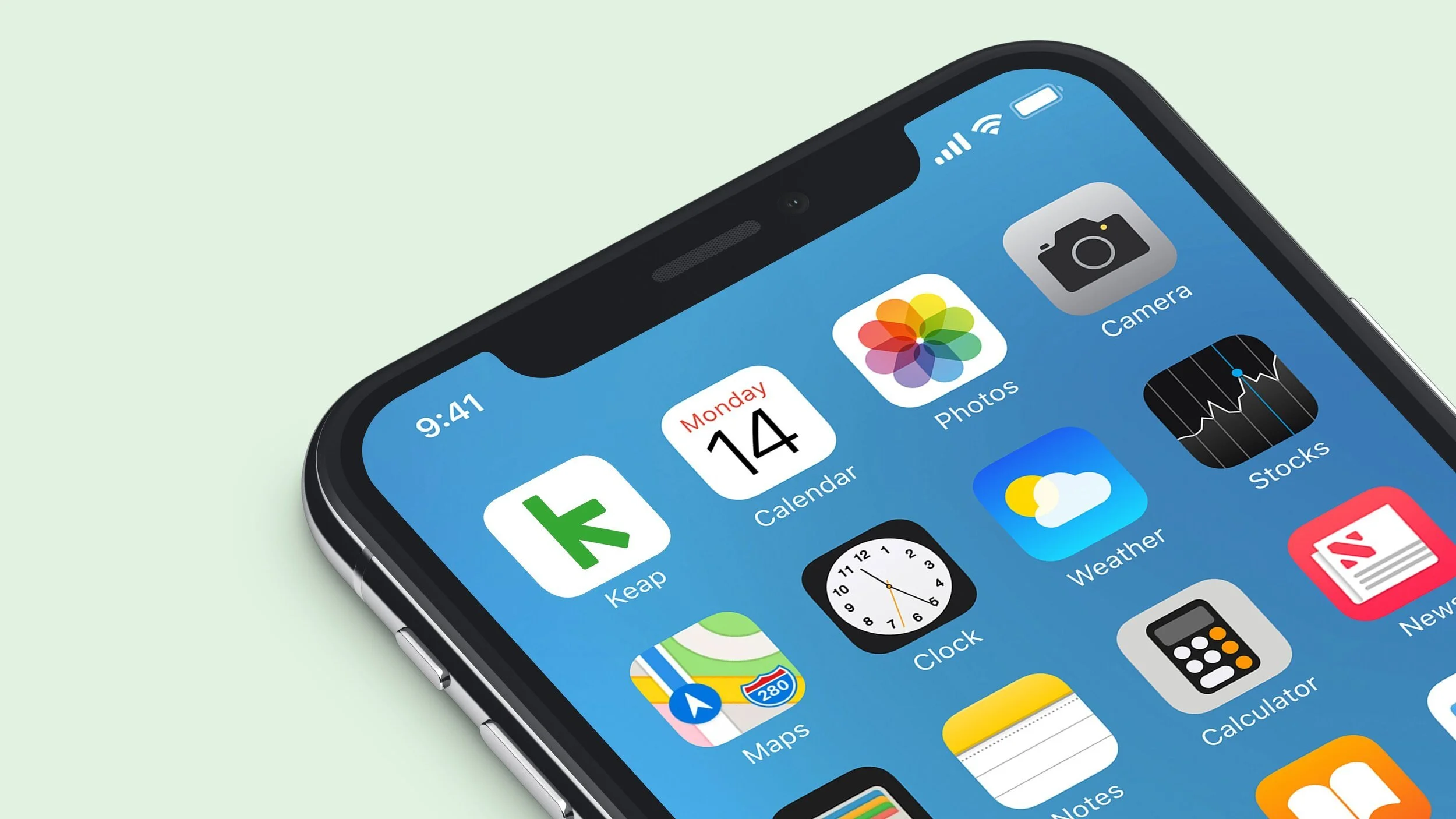
Rebrand of Infusionsoft to Keap
Renaming and repositioning Infusionsoft to connect with a new generation of entrepreneurs
Infusionsoft had strong product-market fit, but they’d reached the limit of their early adopter curve. They needed to go down market to reach the next growth phase, but the brand had become synonymous with complexity. What started as an all-in-one marketing engine for tech-savvy users couldn’t scale to less technical, time-strapped, growth-minded entrepreneurs. Internally, there was conviction to evolve, but no clear narrative or name to rally around. We needed to clarify who the company was for and what it stood for—before launching anything new.
Approach
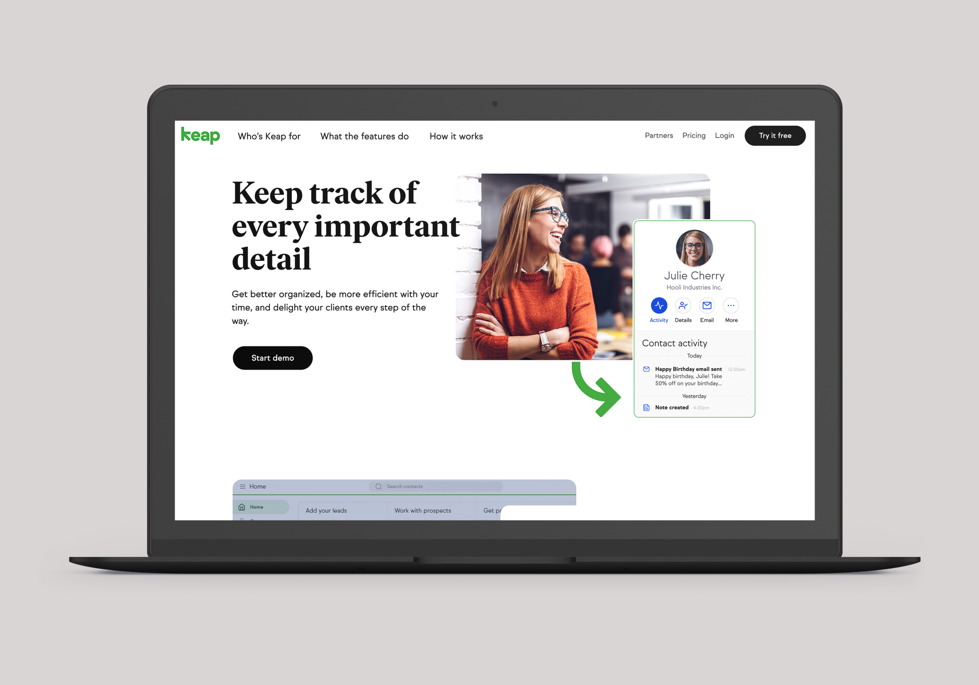
We started with the audience. Not their demographics, but their mindset. These were everyday entrepreneurs building businesses on purpose—not hype. They wanted tools that helped them grow and systems they didn’t have to fight.
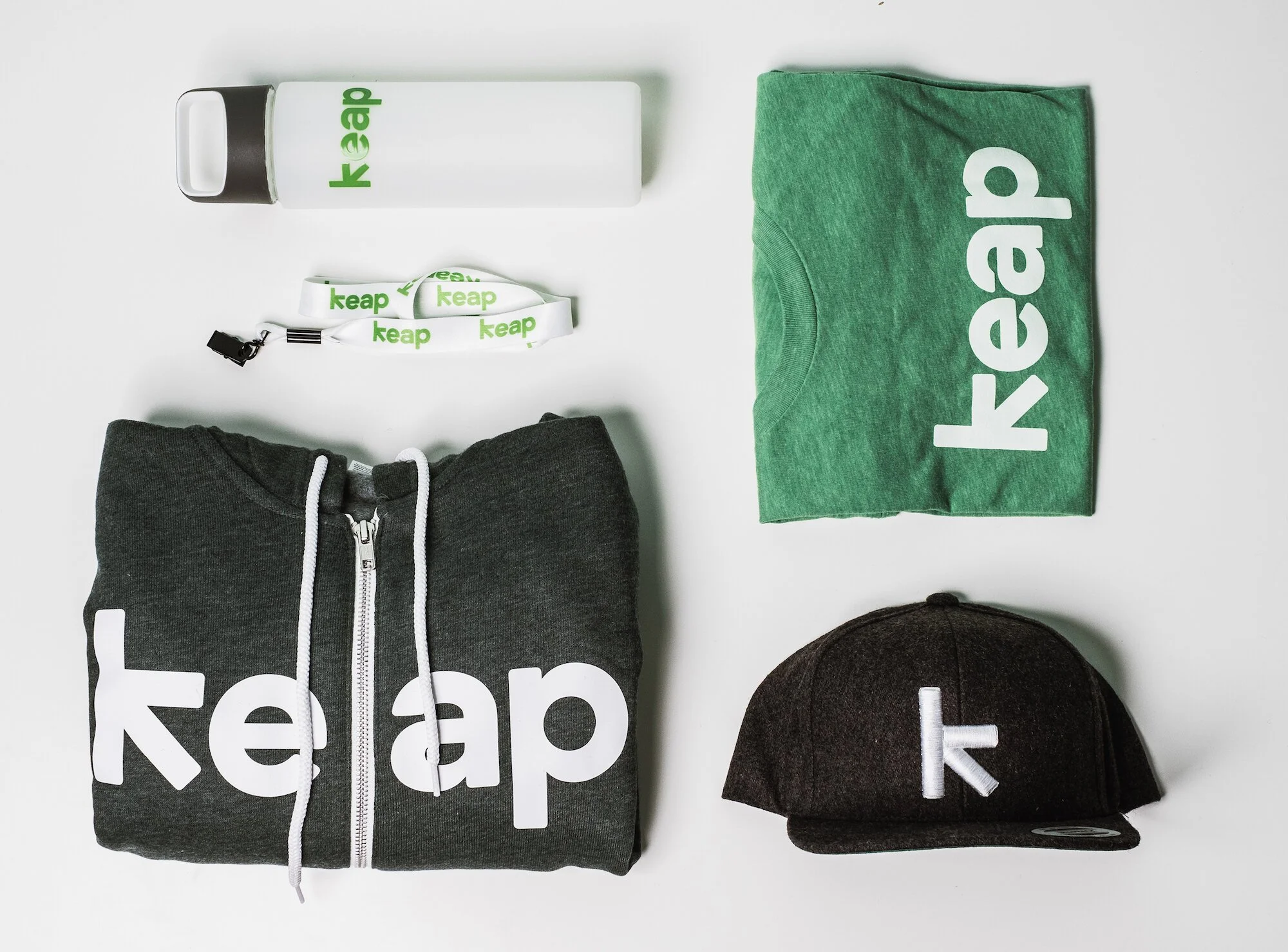
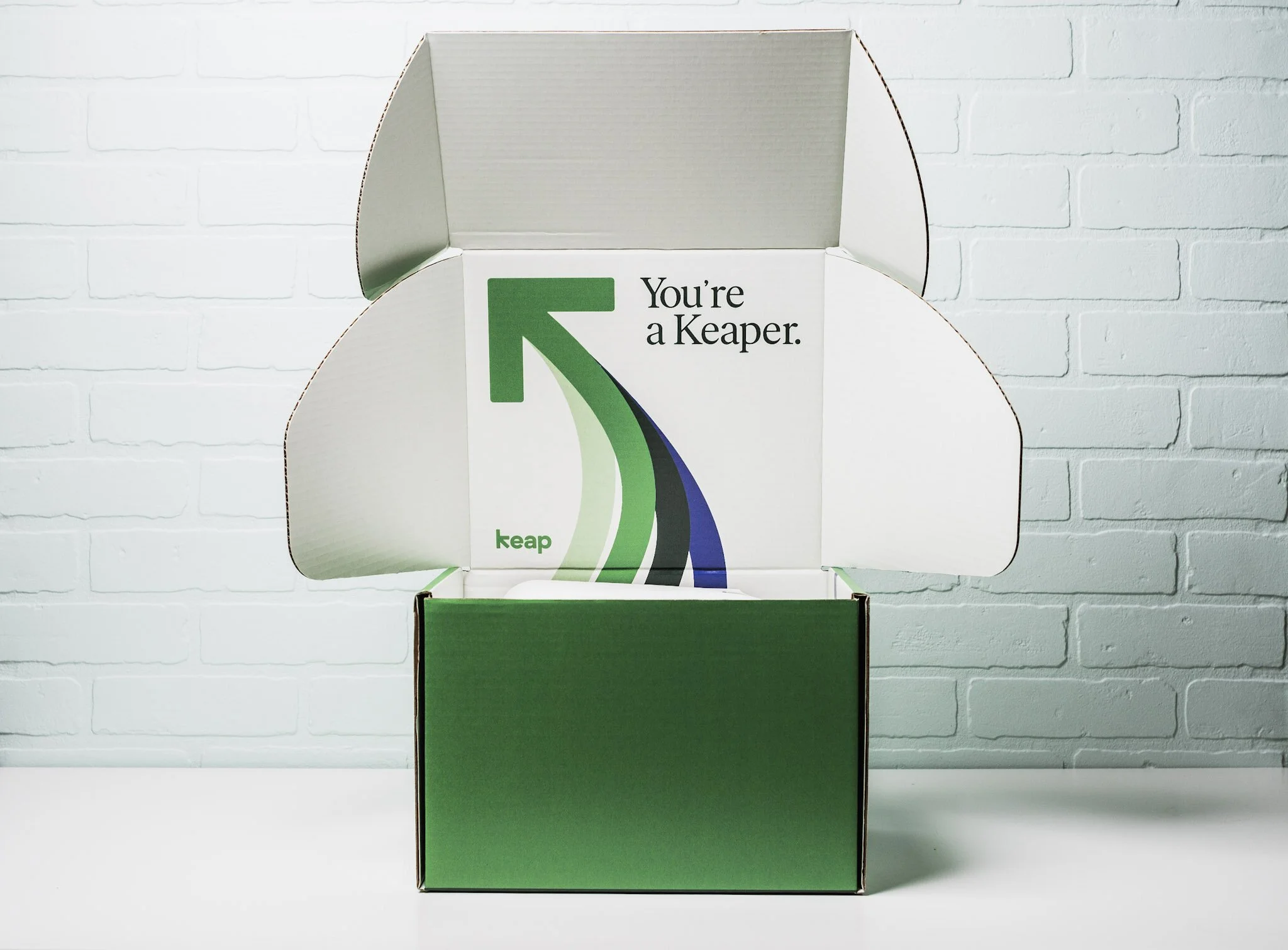
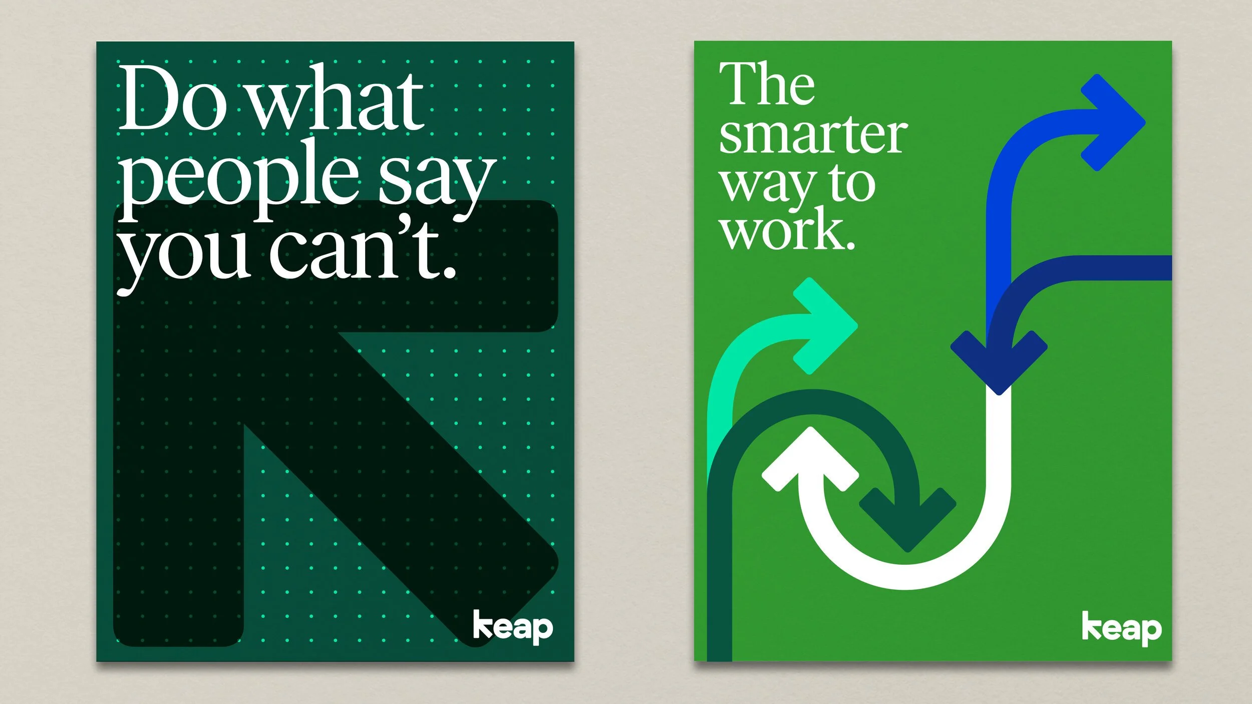
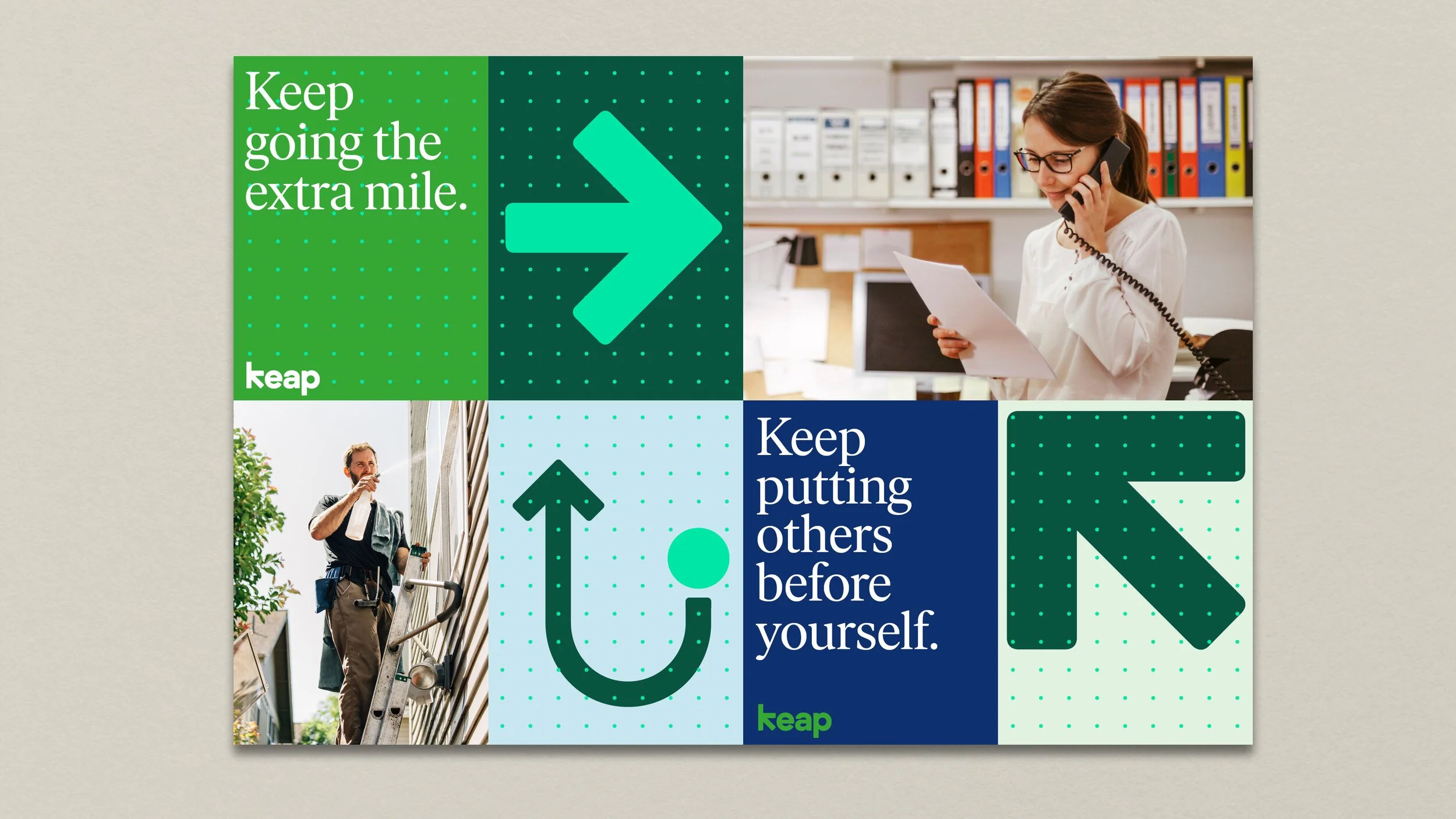
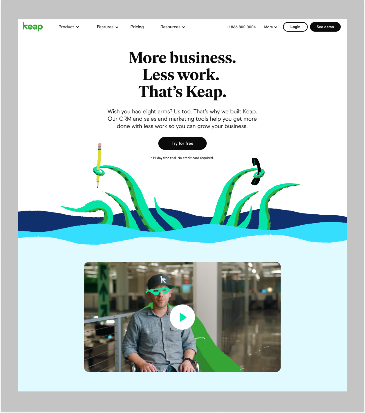
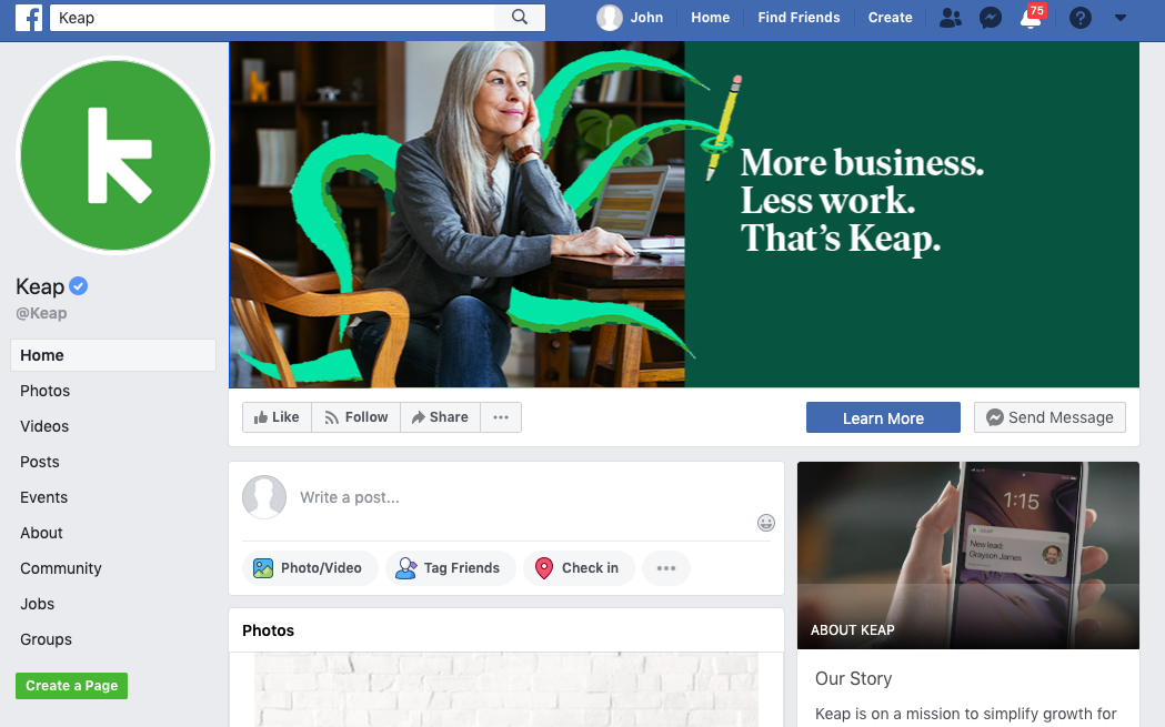
From there, we reframed the brand from complexity to clarity. The new name, Keap, was short, human, and directional—about grit, persistence, and progress. We rebuilt the brand architecture, messaging, and visual identity to match. We launched with a campaign called “Quiet the Doubters,” a direct, emotional anthem that spoke to entrepreneurs' lived experience. No jargon. No platitudes. Just belief and motion.
Outcome
The rename and rebrand helped reposition the company for a new segment.
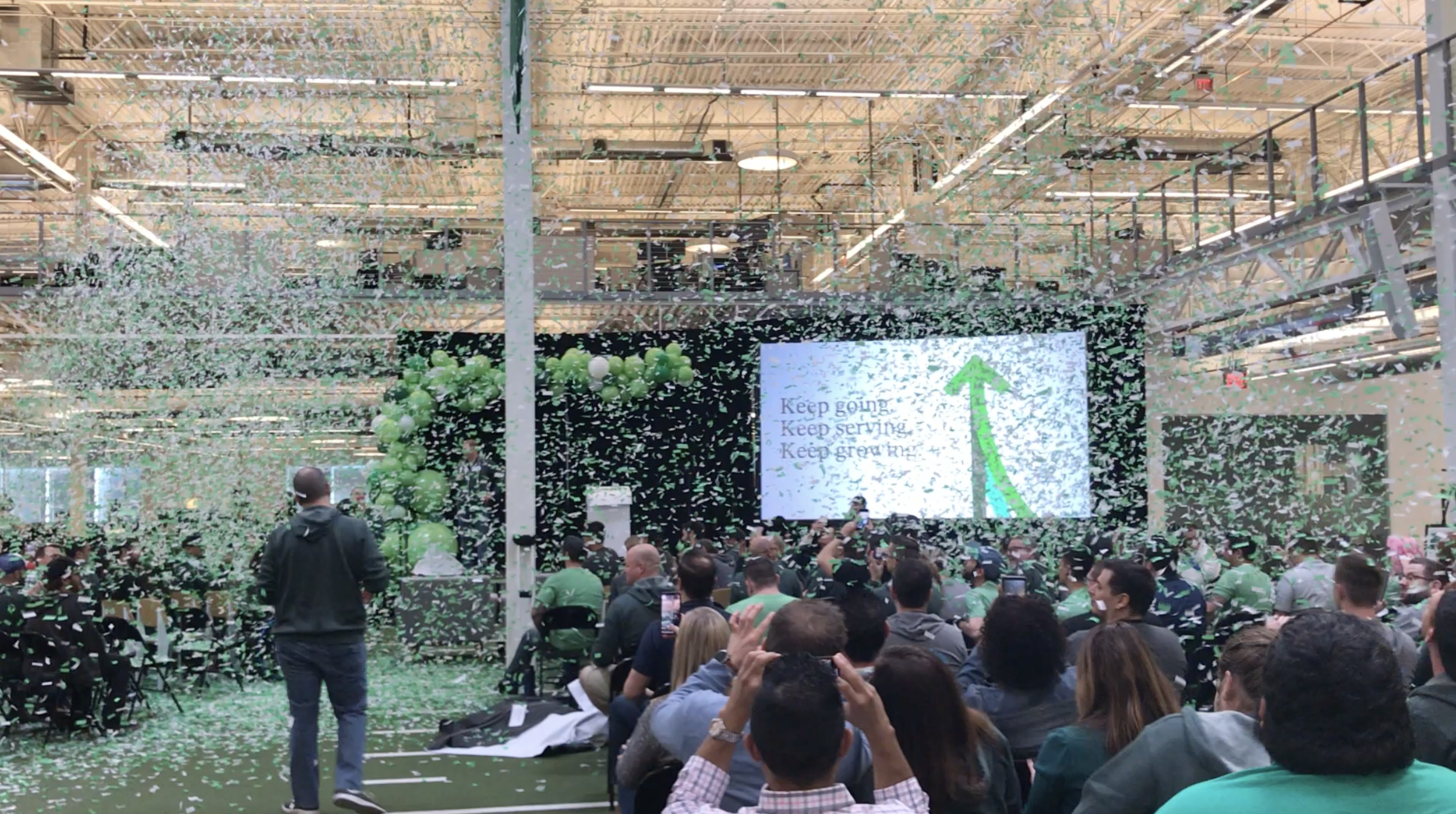
Free trial signups doubled. Brand sentiment improved. The campaign earned 3M+ views and thousands of organic shares. But more importantly, the internal narrative changed. Employees, partners, and customers finally had a story they could believe in again—and a name that matched their ambition.
Clear thinking
Clarity isn’t just for customers. A strong, simple story can reorient an entire company and give people something worth fighting for. “Keap” became more than a name—it became the mindset.
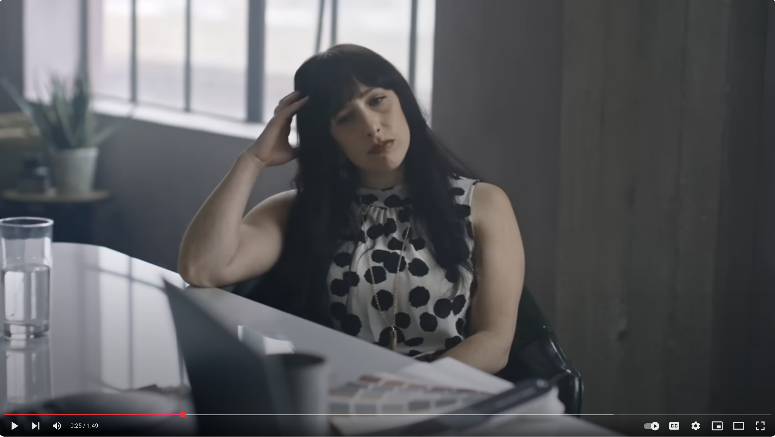
Quiet the Doubters
Over 100 comments on YouTube were clear. The campaign hit the target.
“This might be the first time I actively searched for an ad that I was served so that I could watch it again. Great creative.”
“Wow! This ad had me in tears as I sit in this coffee shop working on my dream.”
“As a person who is in the process of creating a startup... This brought a tear to my eyes....”


Skov’s role:
Executive creative direction and brand strategy (executive wrangling)
The team:
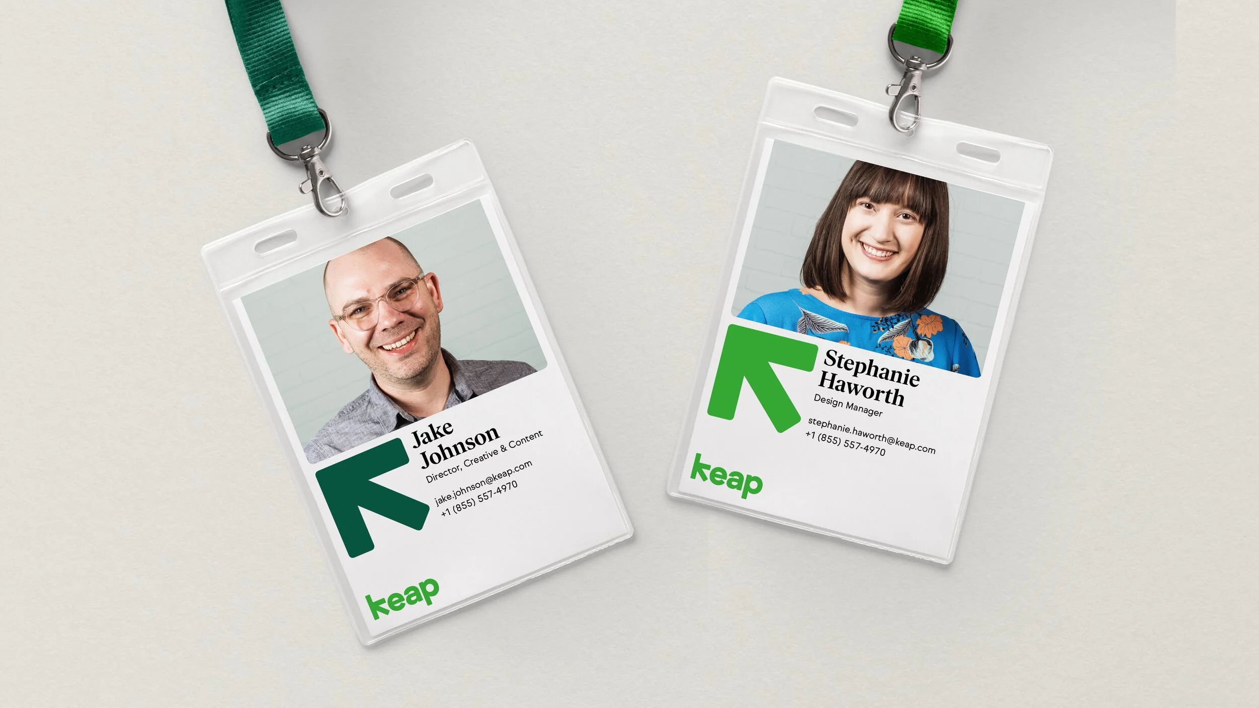
Stephanie Haworth, Art Direction
Craig Grant, Creative Producer
Brandon Clute, Designer
John Blades, Designer
Kevin Lynch, Copywriter
Devin Pitcher, web developer
Jimmy Wilson, Web developer
Pentagram
Gold Front
La Tigre
Letters from Sweden
A cast of thousands